why "art code" ?

In architecture, the facade of a building is often the most important from a design standpoint, as it sets the tone for the rest of the building. Art code is now being used by a new generation of architecture designers to explore innovative ways of generating form and translating ideas in a wide range of creative architectural disciplines

Police Station by voluar architectura


The facade gives to the building a clear and massive appearance. From proximity, the facade’s skin is only a light film whose transparency allows magnificent views of the city from privacy. The anodized aluminum mesh screens that are periodically perforated to control depth of field and light penetration. These panels create visual impedance towards the interior during the day while allowing undisturbed views to the surrounding city, at night, the building glows with light to expose the inner functions to the outside world.
Anodized aluminum gives to the building image a constantly changing, responding to the lights and chromatics variations along day and seasons. In the same way, the degrees of drilling makes the facade seems different according to the observer’s position.
Inside, all the work areas are organized around an empty space, a large full-height interior patio and sets up the dialogue between the private area and public spaces. The unifying element of the project is the light that comes through skylights in this atrium. This space, combined with the use of glass in the work units gives all the space inside a panopticon character both horizontally and vertically. The private spaces by contrast are easily distinguishable as cantilevered solid cubes protruding out of the glass box, and a series of terraces and patios that appear on the facade.

The Ronda Building by estudio lamela

The project has sought to transform the roofline into useful and pleasant spaces for the user, from which you can see the river and part of the city that surrounds it. The starting point was a structural skeleton and the project reuses some of the previous installations.
The different volumes, jutting out with sinuous forms, remain consistent with its function and harmony with its essence, projecting color and dynamic outwards.
We can distinguish between 3 sub-groups with pre-existing forms which have to be maintained: the Ronda buildings – more linear in shape, but with undulating facades-, the Ebro buildings – shape like a wateter droplet – and the Actur building. In all cases there are plans for intermediate floors to allow passage from two levels at a height of eight meters to four at four metres. There is also a “surgical” type of operation to open spaces and relocated cores necessary for future office use.

Villiot Rapee Apartments by hamonic + masson

The project embraces new concepts of living together primarily based on generous outdoor spaces, both private (balconies) and communal (floor area), as well as on an extrapolation of the advantages of detached houses, which have now disappeared forever from Paris – having one’s own floor space and thus being rooted in the soil.
Each level and each flat has a different floor lending itself to different practices and uses. Rather than being like a balcony, a loggia (or a terrace), which can be seen and used on a daily basis, winds its way around the outside of the flats and gives residents the feeling that they live outdoors. This “poured garden” creates close ties to the building’s external environment.
Climate planning and sound-proofing have also left their mark… and permitted a system of “truly outdoor spaces” that are therefore independent of the internal floor-plan, creating a stack of more or less closed terraces and more or less open loggias wrapped around the four sides of each tower like a “serpentine”. One can stroll around a flat, walk out of the bedroom and into the living room; there are many paths to choose from and many surprises in store. But the main thing is that no one can see their downstairs neighbor, and the flats opposite are occluded by screen walls and balustrades.

Titanic Belfast by todd architects

The building's form conjures up a mass of maritime metaphors; its four projecting segments are instantly evocative of ships prows ploughing their way through the North Atlantic swell.
The building concept created an architectural icon that captures the spirit of the shipyards, ships, water crystals, ice, and the White Star Line’s logo. Its architectural form cuts a skyline silhouette that has been inspired by the very ships.
Behind this shimmering crystalline facade, four dynamic ships hulls hold nine galleries. Glass balconies overlook the shipyard, drawing office, slipways, and Belfast city centre. The five-storey central atrium is inspired by the majesty of gangways, gantries, cranes that filled the void between the Titanic & Olympic when they lay side-by-side upon the slipways.

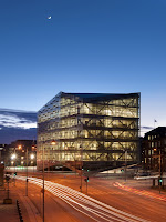
The Crystal by schmidt hammer lassen architects

Freestanding on the site, the building reads as a transparent, geometrical, glazed form which, resting only on a single point and a single line, floats as a visually light, crystalline structure above the plaza. The building and the plaza are designed to interact with each other and with the surrounding city
In terms of both form and scale, the building is intermediate between the city and the harbour, and harmonises with neighbouring buildings. On the southern side, it rises with reference to the gable apex of the “Elephant House” and creates space for the main entrance. 
The double-glazed façade has integrated solar screens and is decorated by a subtle silk screen frit design that mitigates solar ingress, reflects daylight, and gives the building a homogenous expression which enhances its sculptural form.

San Sebastian Subway Entrance by snohetta

The entrance design is based on a continuous movement from underground level to over ground, and vice versa. The design element goes from being a ceiling structure underground to create a roof structure over the stairs and up over ground. The structure describes the transition between the two states and connects the city life with the metro world.
The roof structure extends the width of the stair creating an area on the side where we have placed a bench and information signing. This will give the entrance a connection to the street life and create small urban spaces around the entrance where it possible. 
The roof and ceilings structure is built up as a honeycomb structure in aluminum or steel. The pattern of the honeycomb is inspired by marine structures and geometry. The honeycomb structure is a sufficient way to build up a light open structure with depth. For the roof portion of the structure can be glazed on both sides and will behave as a sandwich structure. The idea is that the honeycomb structure is the basic element which other element can be added on, like glass on top side of roof portion, railings, sidewall or bench

Milanofiori Housing Complex by obr

The interface between the building and the garden becomes the field where interaction between man and environment takes place. This interface is defined by the “C” form of the complex which encompasses the public park, and by the porosity from interior to exterior that characterizes all 107 apartments. The two facades are designed differently with one more urban, facing the street outside, and the other one more organic, facing the inner park.
The design of the urban facade stimulates a sense of belonging thanks to the composition of white frames which identify separately the units. These frames include vertical wooden panels of different widths which can slide across the frames and control the inner light as necessary. The organic facade overlooking the garden features double glazed bioclimatic greenhouses. The co-planarity between the glass of the greenhouse and the glass guardrail covering the string-course creates an effect where the shape of the construction and the background merge and reverse their roles constantly, producing kaleidoscopic effects overlapping the reflection of the public garden outside with the transparency of the private garden inside. 
The geometry of the building is shaped by translation of the upper levels in line with positions of optimum solar exposure and by tapering of the external terraces in order to increase introspection among residents. The winter garden has a double value: an environmental value in providing a buffer zone which allows thermal regulation, and an architectural value in allowing extension of the interior living space towards the exterior landscape (and vice versa) permitting different uses from summer to winter.


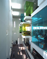
Bishan Public Library by look architects

The metaphor of a tree house was invoked from the onset of design conceptualization to create an environment for learning via a journey of discovery and play. 
The use of skylights, trellises and colored glass transforms incoming daylight into a myriad of shades and colours, creating an intriguing dappled light quality within the library that simulates light filtered through the foliage of trees. 
‘Pods’ cantilevered off the main building façade exude a distinctive charisma on the exterior and create suspended alcoves at an intimate scale from the building interior. The library is raised above the anonymity of its mixed used neighborhood and sets out to stir the curiosity of the community.


Tartu Rebase Street Residential

The concept behind the River Towers is clear and simple: organizing spaces according to their main functions and distributing between two big rings: the service ring and the living area ring.
The exterior ring is made up of the living areas found in houses, offering enough sunlight exposure and vast landscape views. Since the structural elements are concentrated in the inner ring, the area is more open, offering flexibility with the organization of its spaces.  The thin movable walls are simplified to meet the needs of its changeable inhabitants over the years.
The exterior ring is surrounded by a continuous balcony and through its irregular shape creates an authentic space that offers each house a completely different private outdoor area.  This type of balcony was designed in order to lighten the visual volume of the building and integrate it into the landscape.

Social Housing by arquitecnica

The Project consists in creating 120 public housing under lease for young people and it’s located in a new urban expansion area in the town of Parla (Madrid).
It was decided to adopt a typology of open blocks in the plot, the final result was a large spatial unit with two linear blocks that are adapted to the topography of the plot.
With this volumetric distribution is achieved an optimum performance of the plot in terms of number of houses and their quality, and at the same time reflects the urban’s application.

hot design book

Related Posts Plugin for WordPress, Blogger...